
Designing the “Funnel” Feature for KPiQ: A Journey into Interactive Marketing Analytics
As a product designer, I'm well aware that creating features that truly resonate with users requires a thoughtful and iterative design process. In this blog post, I'll delve into the design journey behind the “Funnel” feature for KPiQ, a web app that empowers small business owners with AI-driven marketing analytics. Our goal was to simplify complex data while allowing users to explore deeper insights. Let’s break down the process step by step:
My Role:
As Director of Design, I lead a team of 3 designers and 3 product managers to create KPiQ from the ground up. From user research and design through engineering and launch, we took KPiQ from idea to MVP. I implemented a design sprint methodology and Design System to help the team hit deadlines. The product is in Beta with a $300k ARR waitlist.
1. Understanding the Landscape: Research and Discovery
Before diving into design, we needed a solid understanding of our target audience and their pain points. We conducted user interviews, surveys, and competitive analysis to gather insights. Here’s what we discovered:
User Persona: Our primary user was a small business owner who juggled multiple responsibilities. They lacked the time and expertise to decipher intricate marketing data.
Challenges: Users struggled with overwhelming dashboards, unclear spend allocation, and missed opportunities due to lack of insights.
Opportunities: We saw an opportunity to create an interactive visualization that would guide users through their marketing spend and budget allocation.
2. User Flows and Task Analysis
With our insights in hand, we mapped out user flows. Here’s how the “Funnel” feature would fit into KPiQ:
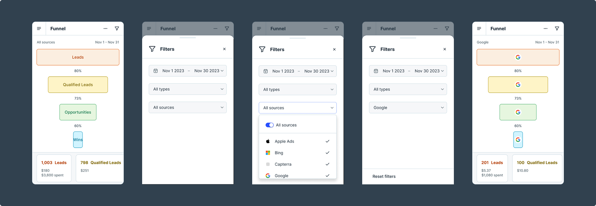
Accessing the Funnel: Users would find the “Funnel” feature within the main dashboard. It needed to be easily discoverable.
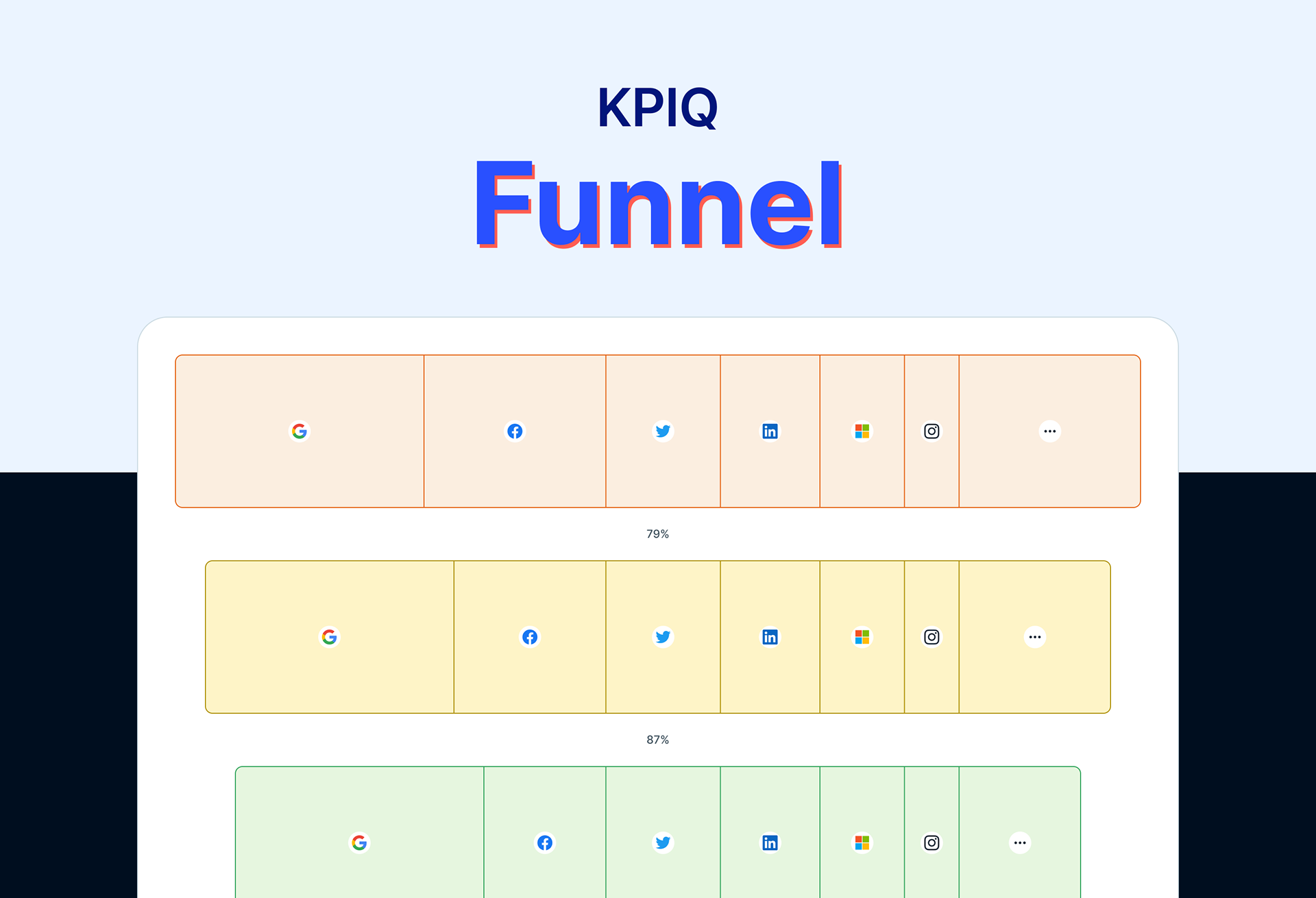
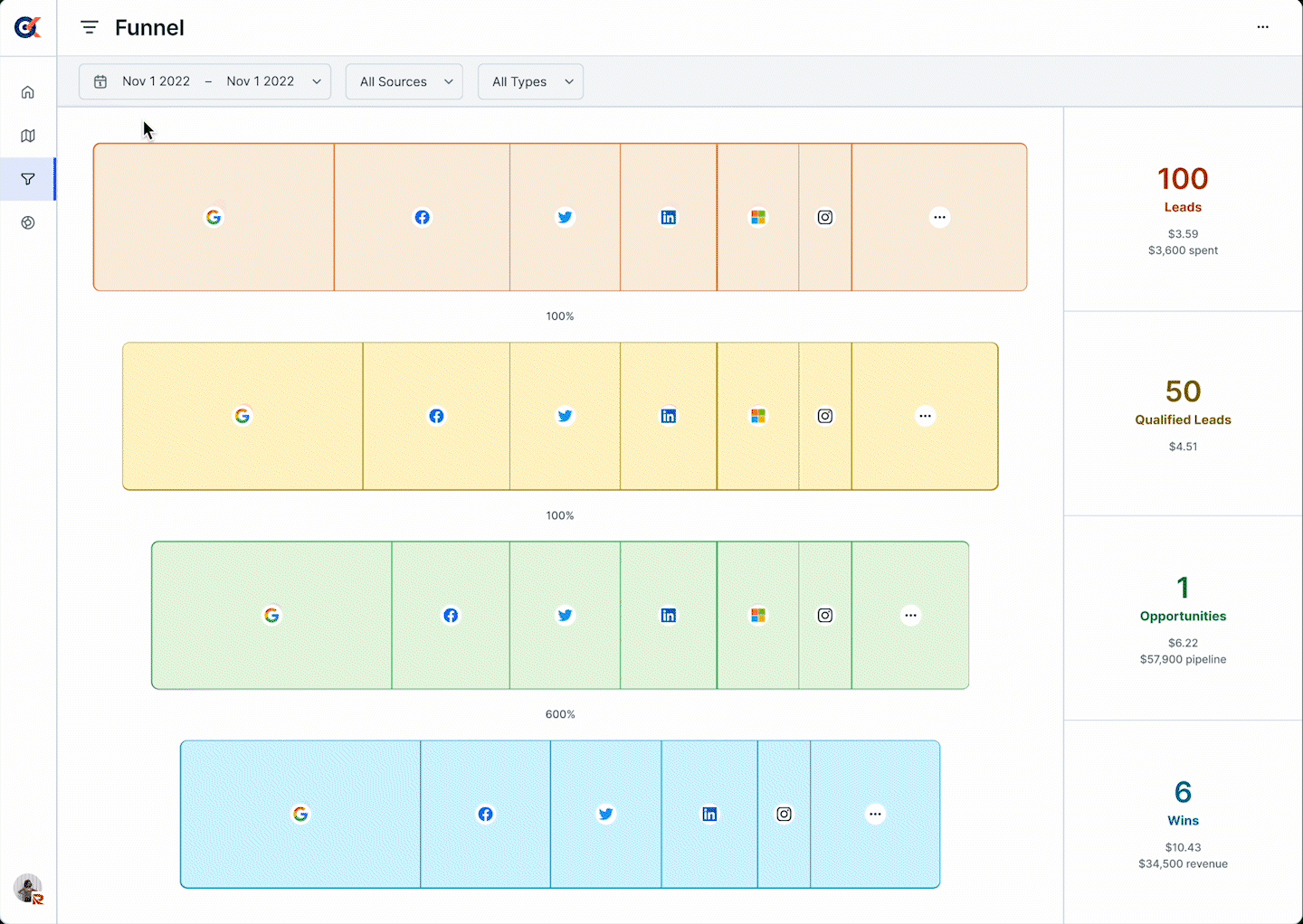
Initial View: Upon opening the Funnel, users would see a high-level funnel chart showing spend distribution across channels.
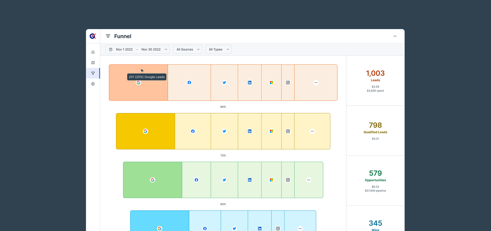
Interactive Exploration: Clicking on a specific channel would reveal deeper insights, such as conversion rates, ROI, and performance trends.
Drilling Down: Users could drill down further to explore specific campaigns or time periods.
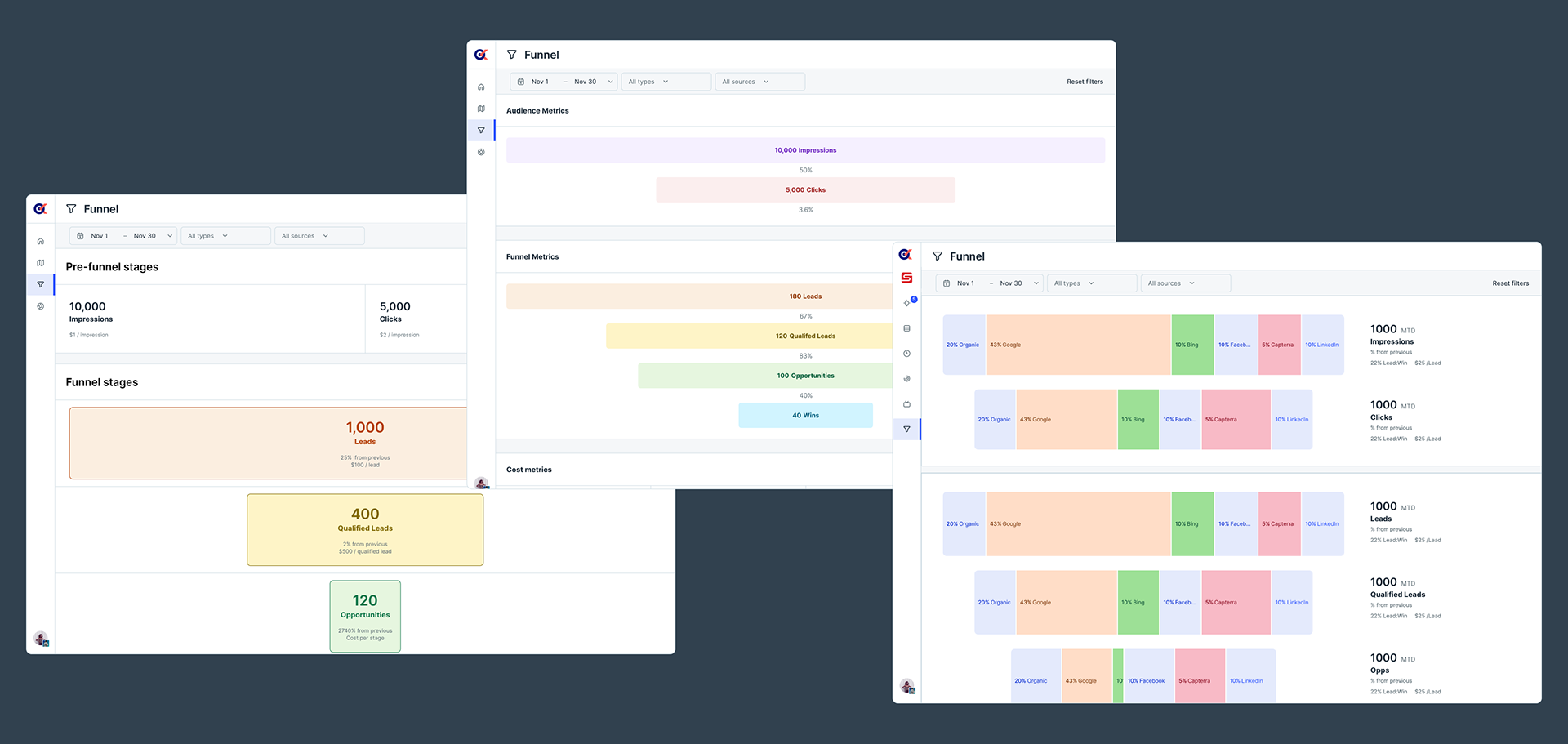
3. Design Exploration: Sketches, Wireframes, and hi-fidelity
We sketched out various concepts for the Funnel feature. Our wireframes included:
Simplified Funnel: A clean, minimalistic funnel chart that highlighted spend percentages.
Detailed Funnel: A very thorough and annotated chart with all data and conversion rates spelled out
Written word: Machine-written summaries and analyses of each source (this one got moved to a different feature:) )
4. Prototyping and Usability Testing
We built a clickable prototype to validate our design assumptions. During usability testing, we observed how users interacted with the Funnel:
Clarity: Users appreciated the simplicity of the initial view.
Hover Feedback: Hover interactions provided context without overwhelming them.
Deeper Exploration: Users naturally clicked on channels to explore further.
5. The final design
The Funnel feature needed to be visually appealing yet not distract from the data. Iterative design cycles refined the layout, typography, and iconography, and relies heavily on progressive disclosure. The first chart that loads on the view is at the highest-possible level with the least amount of granular detail because we can't assume the intent of the user on first load; why would we show specific information about Instagram when the user really is caring about Google in that moment?
Hover Interactions: Hovering over a segment would display additional information.
Progressive Disclosure: We planned to reveal more details as users interacted with the chart.
6. Development and Launch
Our engineering team brought the Funnel feature to life. We ensured responsiveness across devices and optimized load times.
7. Post-Launch Evaluation
After release, we monitored user engagement, collected feedback, and made necessary adjustments. We also added tooltips and guided tours to enhance the user experience.
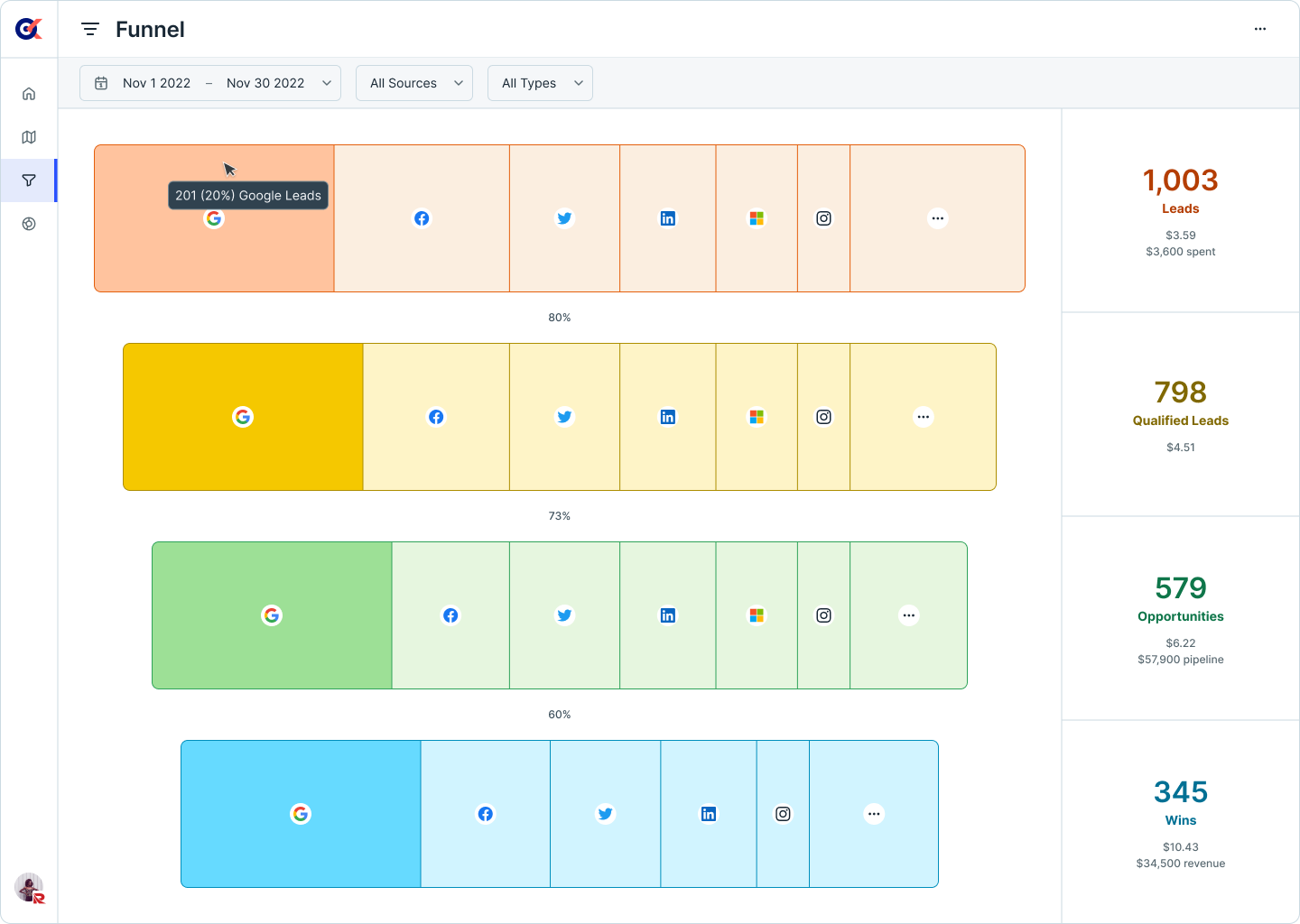
8. Results and Impact
The “Funnel” feature became a favorite among our beta KPiQ users:
Time Savings: Small business owners could quickly grasp their marketing performance.
Confidence: Users felt more confident in allocating budgets based on data-driven insights.
Deeper Exploration: The interactive nature allowed them to dive into specific channels and campaigns.
In conclusion, designing the “Funnel” feature for KPiQ was a rewarding journey. By combining research, thoughtful interactions, and iterative design, we created a tool that empowered small business owners to make informed marketing decisions without drowning in data. Every pixel matters, especially when it simplifies complexity for your users. 🚀