

KPiQ Design System
As the director of product design at KPiQ, I lead a team of three talented designers who work on creating engaging and user-friendly features for our customers. One of the biggest challenges we faced was maintaining consistency and quality across our products, especially as we scaled up and added more features. That's why we decided to create a design system from scratch using Figma, a powerful and collaborative design tool.
A design system is a collection of reusable components, guidelines, and principles that help designers and developers create consistent and coherent user interfaces. A design system can improve efficiency, collaboration, accessibility, and usability. In this blog post, I will share how we created our design system using Figma, and some of the benefits and challenges we encountered along the way.
The Process
We started by looking at some of the best practices and examples of design systems from other companies, such as Material Design, Ant Design, and Shopify Polaris. We then defined the scope and goals of our design system, and created a roadmap for its development.

Iconography
KPiQ is a huge product with a ton of iconographic needs, and we didn't want to spend the additional time or resources to create hundreds of icons and their variants from scratch. We started by researching the libraries available online and found quite a few free options - the main challenge is that we would need to use multiple free libraries to meet our needs, and each library has major stylistic differences that we didn't want to show up in the product. We therefore decided to purchase a large library from UntiledUI. After making minor tweaks and creating some additional custom icons on our own, the icons were ready for primetime!

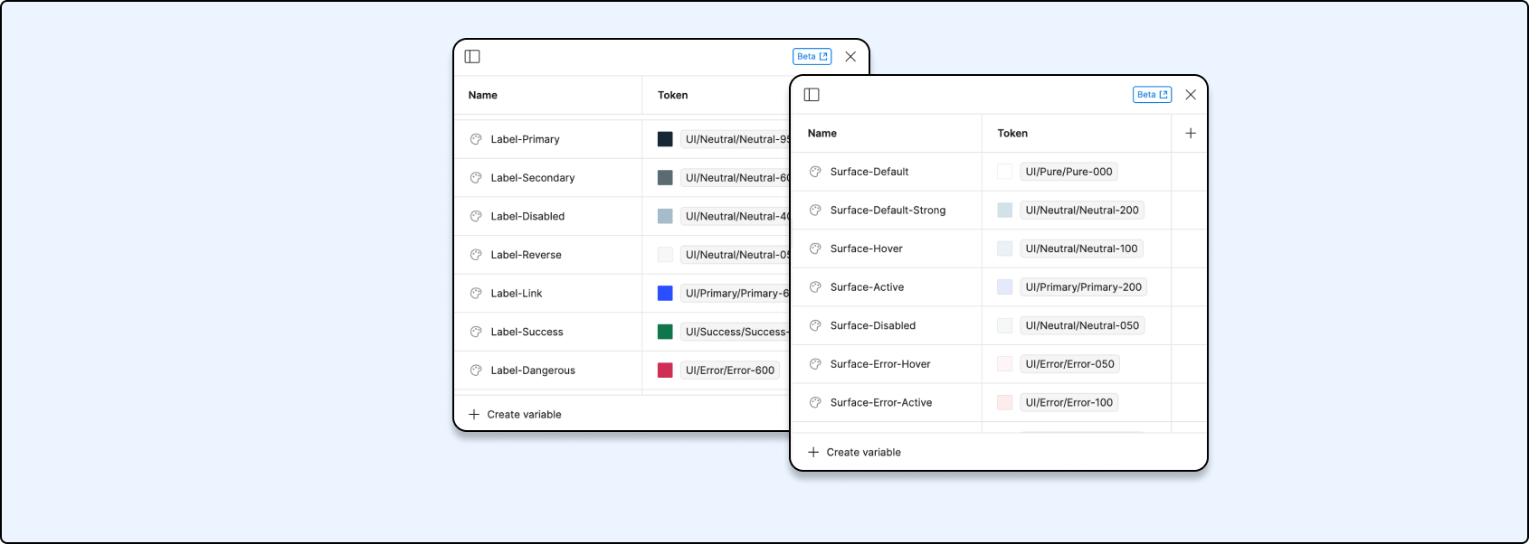
Color Palette
The next step was to create a custom color palette using Figma variables. Figma variables are a feature that allows you to define and reuse colors across your projects. We chose a set of primary, secondary, and accent colors that reflect our brand identity and suit our products. We also made sure that our colors are accessible, meaning that they have enough contrast and meet the WCAG standards. We used a tool called Stark to check the color accessibility in Figma.
Typography
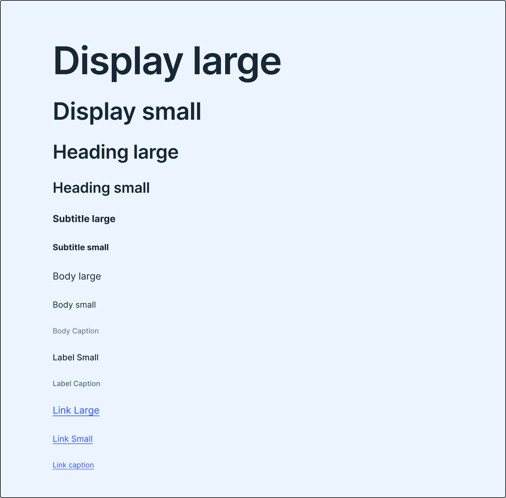
We used a font called Inter for our design system. Inter is a versatile and modern font that works well for both web and mobile applications. It has a large set of glyphs, weights, and features that make it suitable for different use cases. We used Figma's text styles feature to define different typography scales for headings, body text, captions, etc.
Grid
We also followed an 8px grid system for our design system. A grid system is a framework that helps align and organize elements on a page. An 8px grid system means that every element is aligned to an 8px increment on both horizontal and vertical axes. This creates a consistent and harmonious visual rhythm across our products.
Components
After creating the color palette, we moved on to designing the components. Components are the building blocks of a design system, such as buttons, inputs, icons, cards, etc. We followed the atomic design methodology, which divides components into five levels: atoms, molecules, organisms, templates, and pages. Atoms are the smallest elements, such as icons or labels. Molecules are combinations of atoms, such as buttons or inputs. Organisms are groups of molecules, such as forms or menus. Templates are layouts that use organisms to create pages. Pages are the final products that use templates.
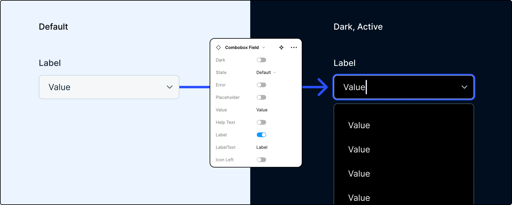
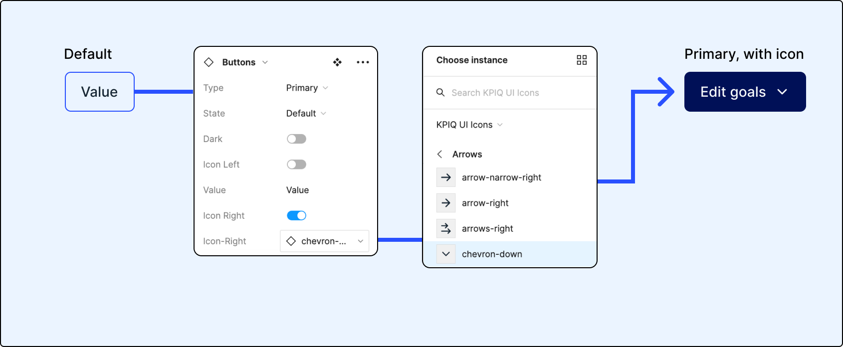
We designed each component with modularity and reusability in mind. We used Figma's auto-layout feature to make sure that our components are responsive and adaptable to different screen sizes and devices. We also used Figma's variants feature to create different states and variations of each component, such as hover, active, disabled, etc. We added descriptions and properties to each component using Figma's description field.
One of the most important aspects of our design system is that it supports both light and dark mode. We used Figma's style overrides feature to create two versions of each component: one for light mode and one for dark mode. We also used Figma's instance swapping feature to easily switch between the two modes in our designs.
The Outcome
After several weeks of hard work, we completed our design system using Figma. We named it Artemis, and published it as a team library in Figma. A team library is a feature that allows you to share components and styles across your projects and team members. This way, everyone can access and use the latest version of our design system.
We used our design system to create dozens of features in KPiQ, such as dashboards, charts, tables, forms, etc. We noticed several benefits from using our design system:
- It improved our efficiency and productivity as designers. We no longer had to reinvent the wheel every time we needed a component or style. We could simply drag and drop them from our library or use Figma's plugins to insert them into our designs.
- It improved our collaboration and communication as a team. We had a single source of truth for our design decisions and standards. We could easily share feedback and iterate on our designs using Figma's commenting and version history features.
- It improved our quality and consistency as a product. We reduced the visual noise and clutter in our products by using a coherent and harmonious design language. We enhanced the user experience by providing clear and intuitive interfaces that follow best practices.
- It improved our accessibility and inclusivity as a company. We made sure that our products are accessible to a wide range of users, regardless of their abilities, preferences, or devices. We also made sure that our products are adaptable to different modes, such as light and dark mode.
The Challenges
Creating a design system from scratch using Figma was not an easy task. We faced some challenges and limitations along the way, such as:
- Figma is a cloud-based tool that requires an internet connection to work. This can be a problem if the connection is slow or unstable, or if there are security or privacy concerns.
- Figma is still a relatively new tool that is constantly evolving and adding new features. We started the design system while figma was still rolling out additional variables, which meant we had to go back and rework many components to support color variables, text variables, etc.
- Figma is not a code-based tool that generates code for the components. This means that we still need to work closely with the developers to ensure that the design system is implemented correctly and consistently in the code.
- Figma is not a comprehensive tool that covers every aspect of a design system. There are still some areas that Figma does not support well, such as animation, interaction, documentation, testing, etc. We had to use other tools or methods to complement our design system. We used confluence to store documentation and testing information to handoff to dev.

The Future
We are proud of what we have achieved with our design system using Figma, but we know that it is not perfect or complete. A design system is a living and evolving entity that needs to be maintained and updated regularly. We plan to continue improving and expanding our design system by:
- Adding more components and styles to cover more use cases and scenarios.
- Updating the existing components and styles to reflect the latest figma features, and feedback from dev and users.
- Creating more templates and pages to showcase the potential and possibilities of our design system.
- Documenting and explaining the rationale and guidelines of our design system using tools like Storybook or Zeroheight.
- Testing and evaluating the usability and performance of our design system using tools like UserTesting.
- Educating and engaging our team members and stakeholders on the value and benefits of our design system using workshops, demos, or newsletters.
Thanks for reading!