Rearchitecting Navigation for Multi-Business Users in Allē Provider
Redesigning a foundational product system to serve the enterprise customers driving 80% of revenue, without disrupting the 80% of users on single-location plans.
The Problem
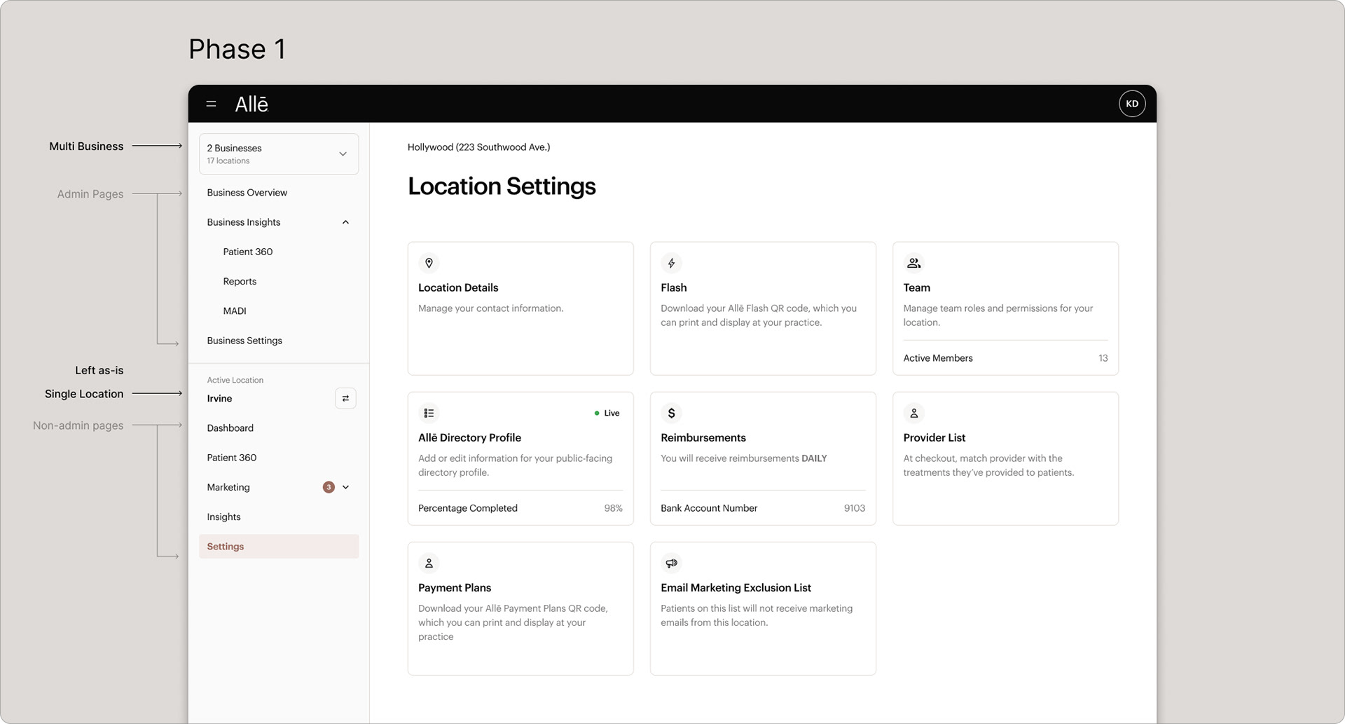
Allē Provider launched for single-location aesthetic practices, but the top 80% of revenue comes from multi-business, multi-location enterprise accounts. The left-hand drawer navigation forced these users to reselect businesses and locations constantly, apply changes in multiple places, and work without any cross-portfolio view.
My Approach
- Interviews with CS reps, admins, and multi-location users from top-tier accounts.
- Two clickable prototypes (V0 + Figma Make) — one for functional logic, one for visual patterns.
- Stakeholder working session presenting five phased approaches with transparent trade-offs.
- Phased rollout starting with admin-level pages (Insights, Business Overview).
Full case study — including research transcripts, prototypes, and final UI — is password-protected. Reach out for access.
Understanding the Problem
When Allē Provider first launched, it was designed to support single-location aesthetic practices, the majority of users by count. But over time, it became clear this wasn't serving the most valuable customers.
~80% of providers operate out of a single location, but those businesses only account for ~20% of revenue. The top 80% of revenue comes from Tier 1 and Tier 2 customers, complex organizations with multiple businesses, locations, and user roles. The original left-hand drawer navigation was becoming a serious pain point for them.
These users faced constant repetition: reselecting businesses and locations, manually applying changes in multiple places, no way to view aggregated data across their portfolio, and near-impossible bulk actions. Page access also varied by user role, creating inconsistency and frustration.
Research
To ground our direction in real-world needs, we conducted interviews with customer success reps, admin and multi-location users from top-tier accounts, and internal product and engineering leads.
Three themes surfaced consistently: repetition (applying changes multiple times per location), confusion (role-based visibility creating unpredictable nav behavior), and frustration (no "portfolio" level view, always limited to one business or location at a time).
Communication and Prototyping
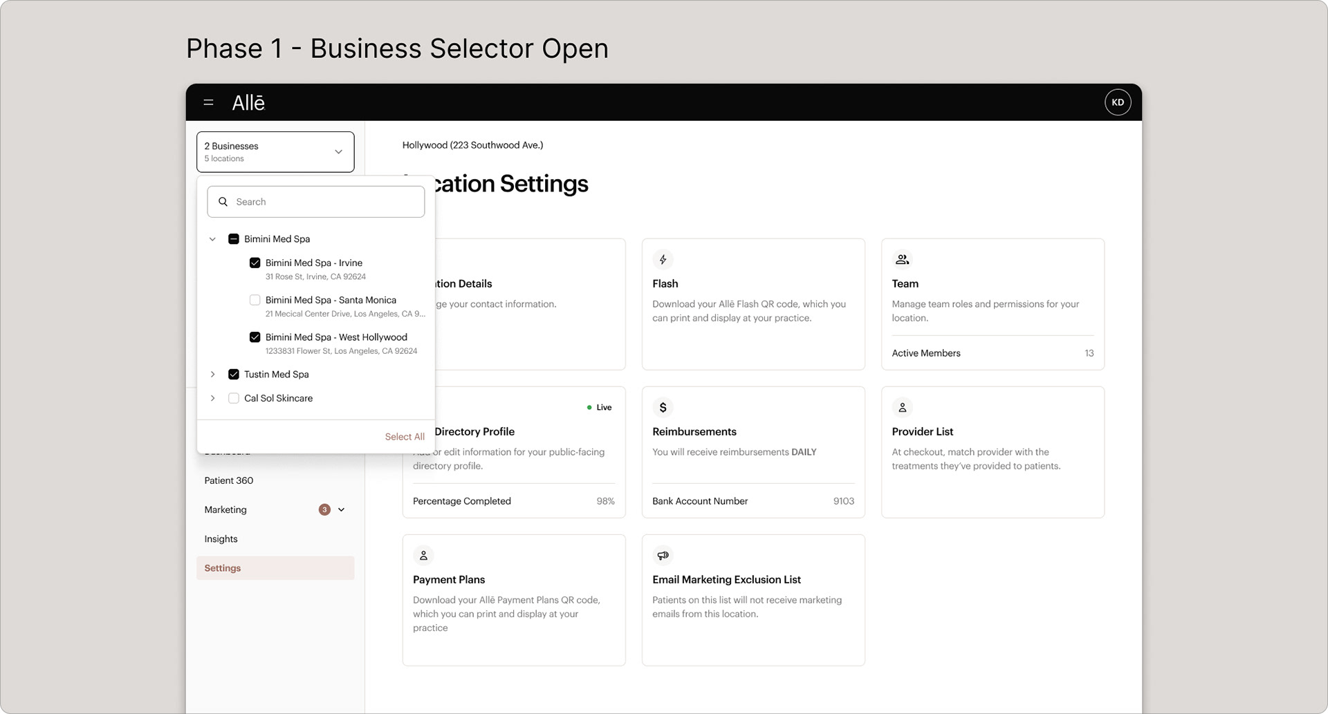
Static mockups couldn't express how navigation adapts based on context, user role, and org structure. We used low-code prototyping tools, V0 and Figma's Make AI tool, to build interactive experiences that demonstrated system logic.
We developed two clickable prototypes: one focused on functional logic (how the system adapts to user roles and org structures), the other on visual and UX patterns (navigation hierarchy, page layout, breadcrumbs). These were shared widely across the company and used with design partner users for hands-on feedback.
Managing Stakeholders
Two internal camps emerged: account reps pushing for a full redesign, and product marketing concerned that incremental changes would confuse users. We organized a stakeholder working session presenting five phased approaches, from a "big bang" launch to a step-by-step model, with transparent tradeoffs on each.
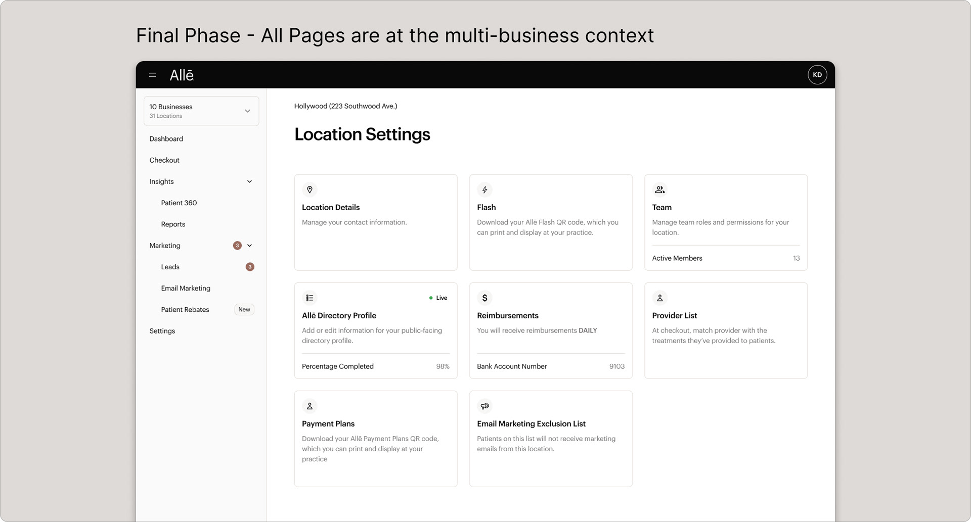
We reached alignment around a phased approach starting with admin-level pages (Insights, Business Overview). These were the most valuable to enterprise customers and the most feasible within technical constraints. Stakeholders didn't just approve; they were enthusiastic.
Strategy: Phasing for Value
Rebuilding navigation from scratch would have taken over a year. The phased approach let us deliver immediate value: new admin pages coexist with existing location-specific pages in a hybrid model, preserving the single-location experience for the majority of providers while unlocking new capability for enterprise users.
Launch and Beta Results
The beta is now live behind a feature flag for top enterprise users. Admins can view cross-business data, access aggregated insights, and manage multiple locations from a unified experience. Early results from a three-month beta: faster workflows, reduced repetition, and greater clarity around navigation.
Reflections
Designing for scale means questioning who the product is really optimized for. By refocusing on the users driving the most business value, we unlocked new value and improved trust with our most complex customers. Prototyping beyond Figma was critical; when architecture and roles affect almost every UI element, clickable prototypes become essential for alignment.