Raken Website Redesign
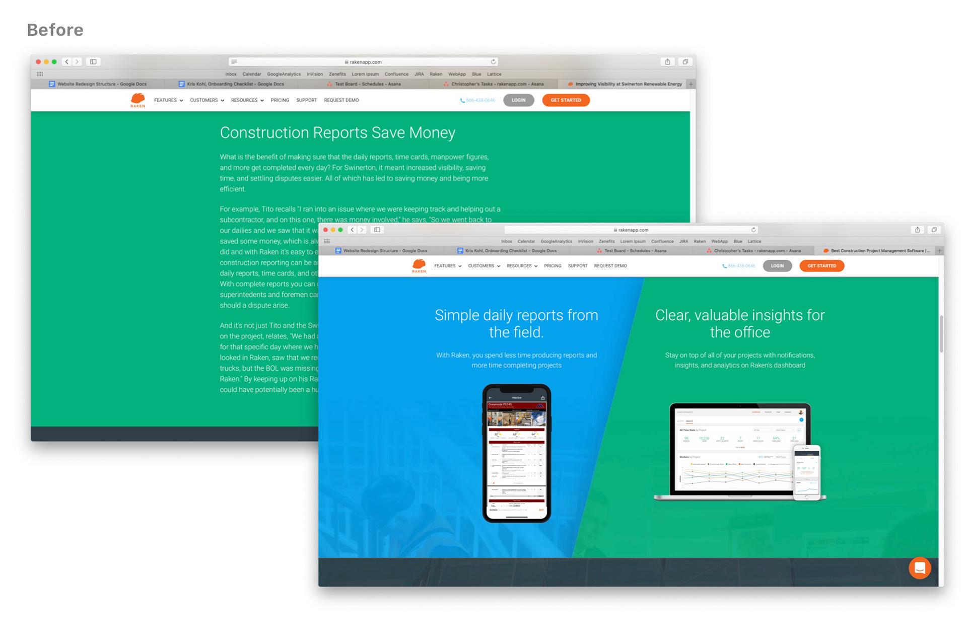
Complete marketing site overhaul. Page speed improved from 50% to 80–90% and simplified navigation down to three clear categories.
The Brief
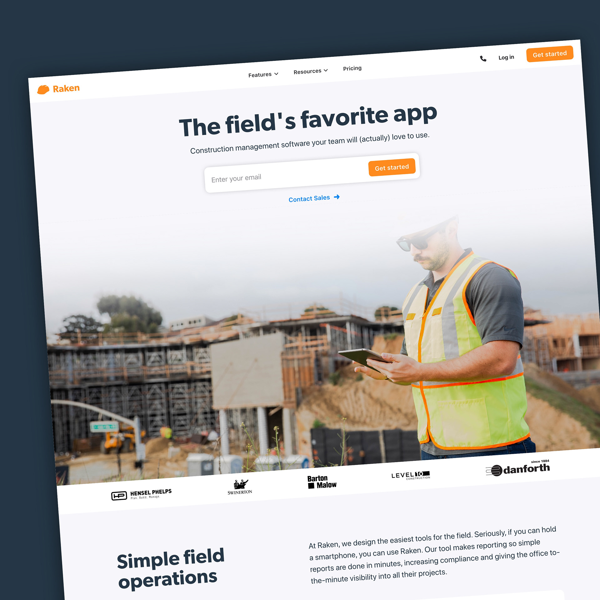
After conducting several user tests and creating early concepts, Raken asked me to take charge and completely revamp their entire marketing website. The existing site had grown organically over time, resulting in inconsistent visuals, slow performance, and a navigation structure that made it hard for visitors to find what they needed.
Modular: Effortless Marketing
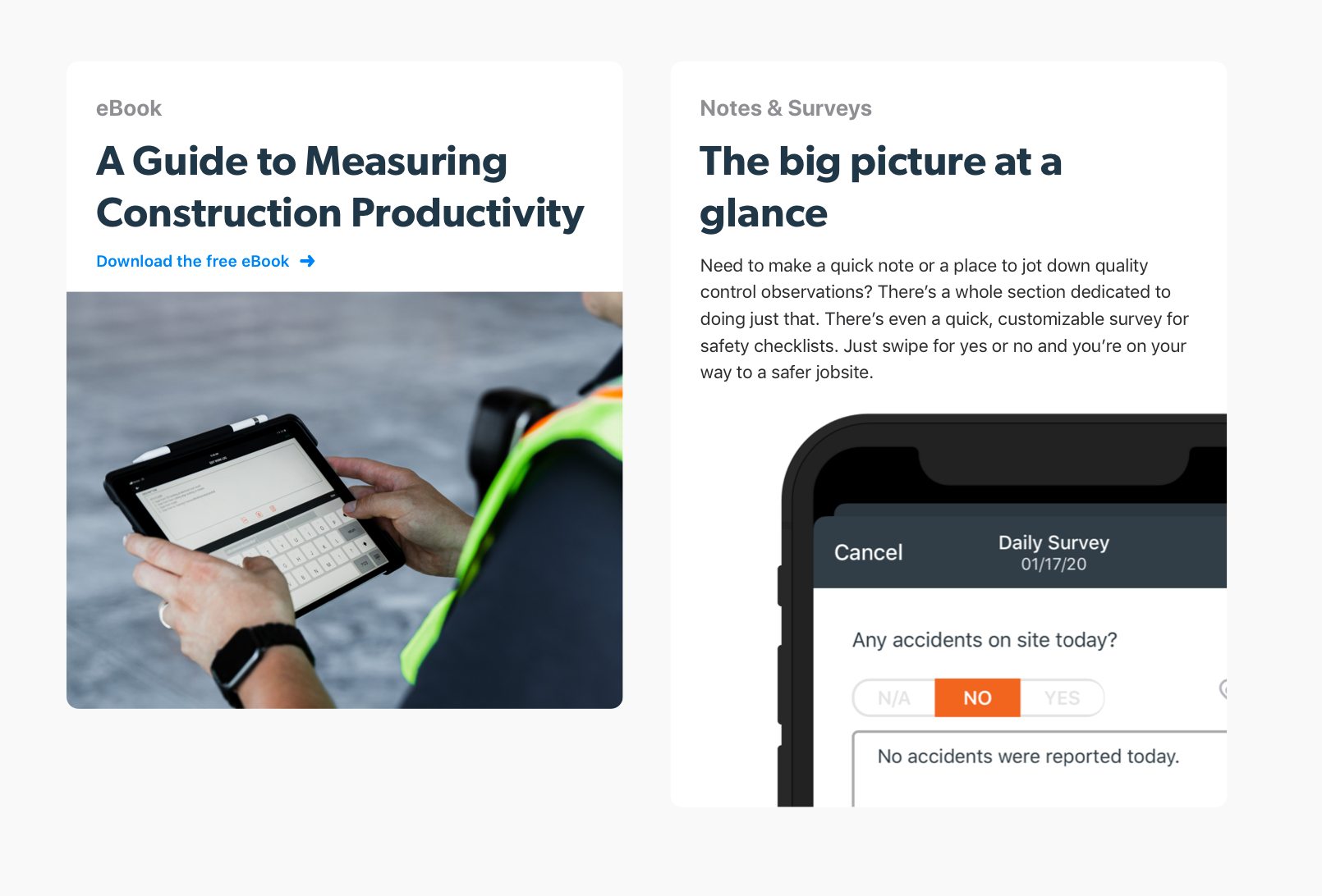
The new site was built on a card-based, modular component system delivered through a headless CMS. This let the marketing team build and update pages independently, with no developer required for content changes, and consistent visual output regardless of who built the page.
Brand: Crafting a More Intimate Experience
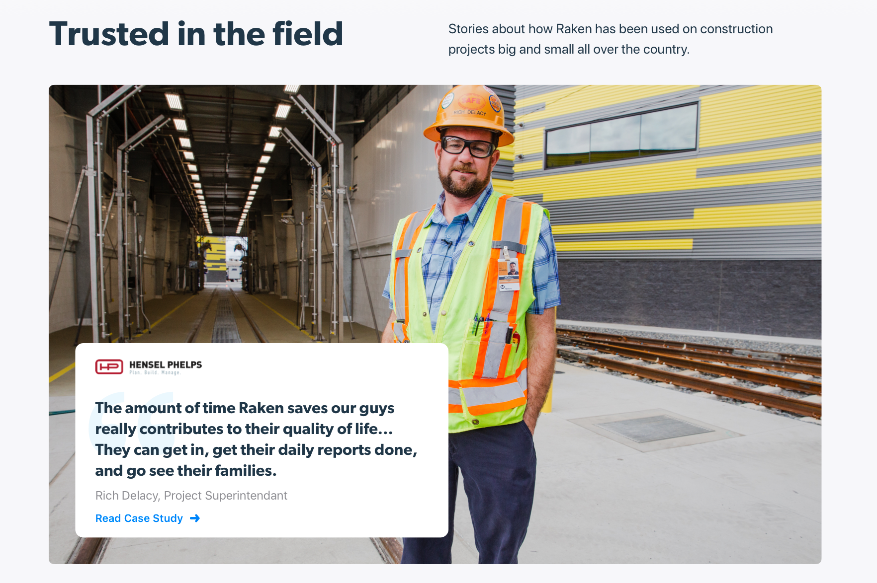
The previous design relied heavily on filtered stock photography, generic and forgettable. The redesign introduced authentic imagery from real job sites and tightened the visual language to feel more grounded and human.
Typography
Shifted from thin Roboto fonts to Gibson Semibold for headings: more personality, more authority. Base font size increased to 16px on mobile and 18px on desktop for readability. System native typefaces for body text kept the reading experience clean and fast.
Color
Strategic orange color usage was limited to the logo and primary buttons only, reducing visual noise and making CTAs unambiguous. Secondary colors and neutral backgrounds carried the rest.
SEO and Page Speed: Native, Accessible
Performance improvements came from several focused changes: increased page length for better SEO coverage, reduced number of typefaces loaded, and elimination of unnecessary third-party scripts. Page speed scores improved from 50% to 80–90%, a significant jump with direct impact on search visibility and user experience.
Navigation: Hierarchy to the People
The old site had six parent navigation categories: too many choices, too much cognitive load. The redesign reduced this to three: Features, Resources, and Pricing. Simpler hierarchy, faster decision-making, clearer path to conversion.