Raken Website Redesign
After I conducted several user tests and created a few early concepts, Raken asked me to take charge and completely revamp their entire marketing website. That's hundreds of pages, controlled by a Headless CMS, without a consistent component system. In other words, this is one of the most exciting projects for a designer.
Before beginning on the overhaul, I started with several user tests to confirm areas to focus that would have a large impact on the overall site.
Modular
Effortless Marketing
I started by creating a simple, card-based system that would allow our developers to develop each component, then make them available in a Headless CMS. This approach allowed for very quick development using standardized components, rather than completely custom work on each webpage. If we want to make updates to a component, we do them once and they are effective on every page. Our development and marketing teams were happy to not need multiple sprints to churn out a page.
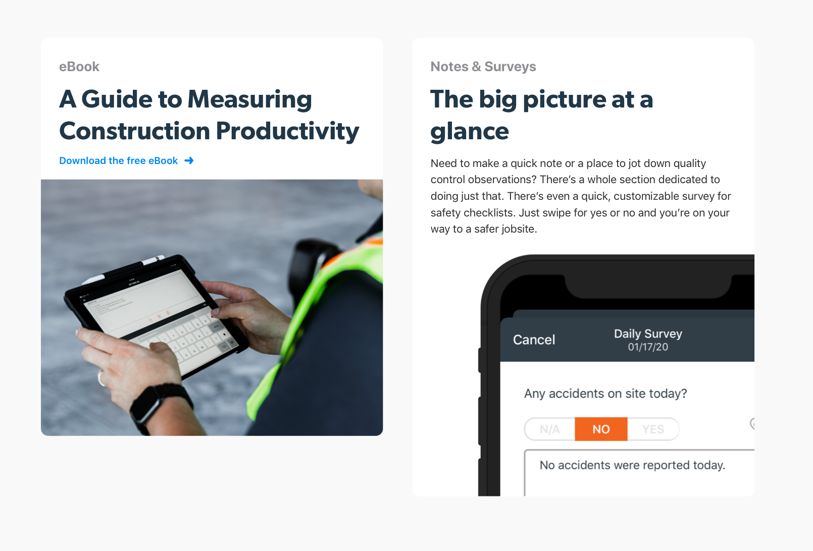
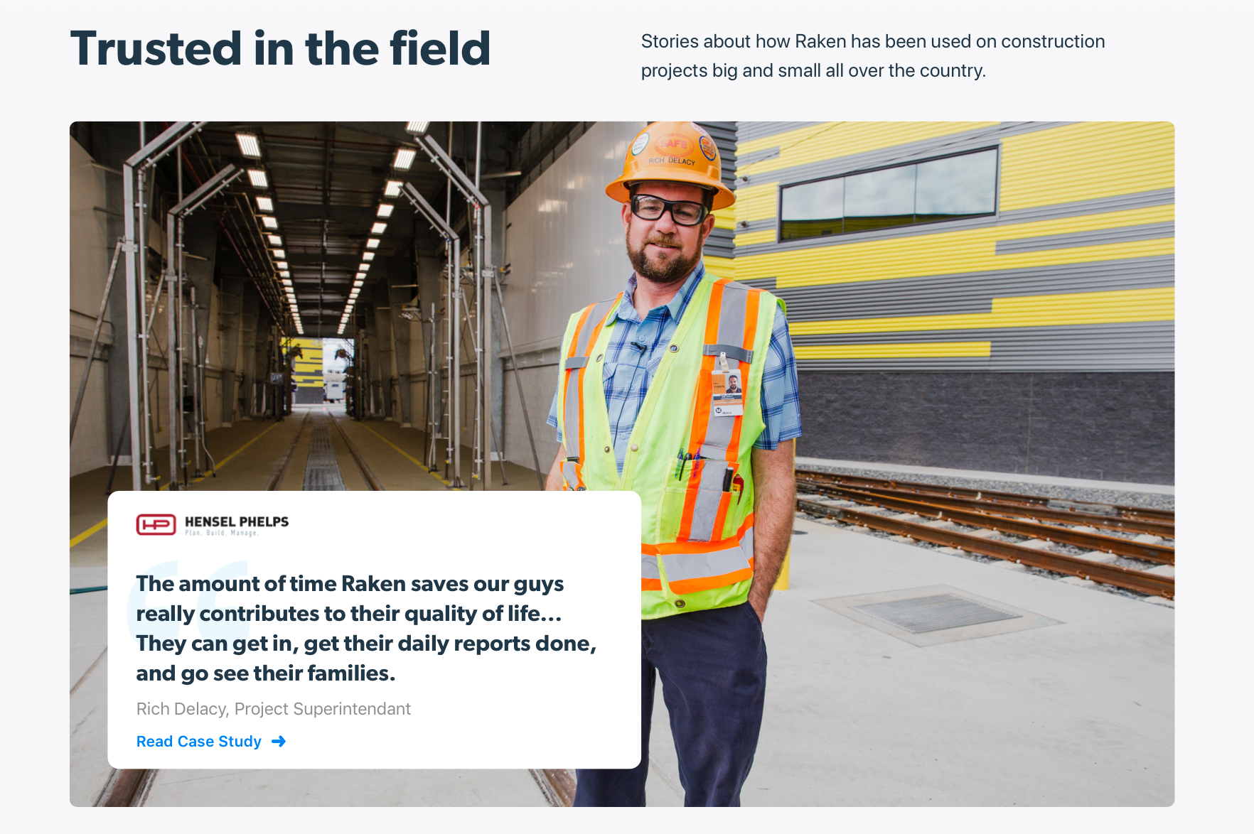
Changing the image at the bottom of the card has a significant impact on the overall look and feel of the section. The card on the left is used in our footer to direct a user to a relevant eBook, and the card on the right is used on our Daily Reports page to explain the feature.
Brand
Crafting a more intimate experience
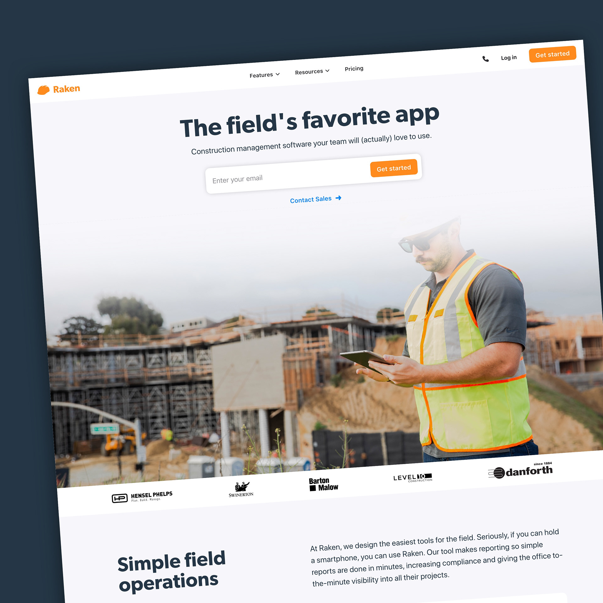
On the prior website, screenshots floated over heavily-filtered stock photography of construction site scaffolding and hard-hats. While this definitely made the Raken website look "construction," it didn't tell the strongest story. Before starting on the website, we took some time to completely reconsider the brand's visual language. You can read about that project in my other post.
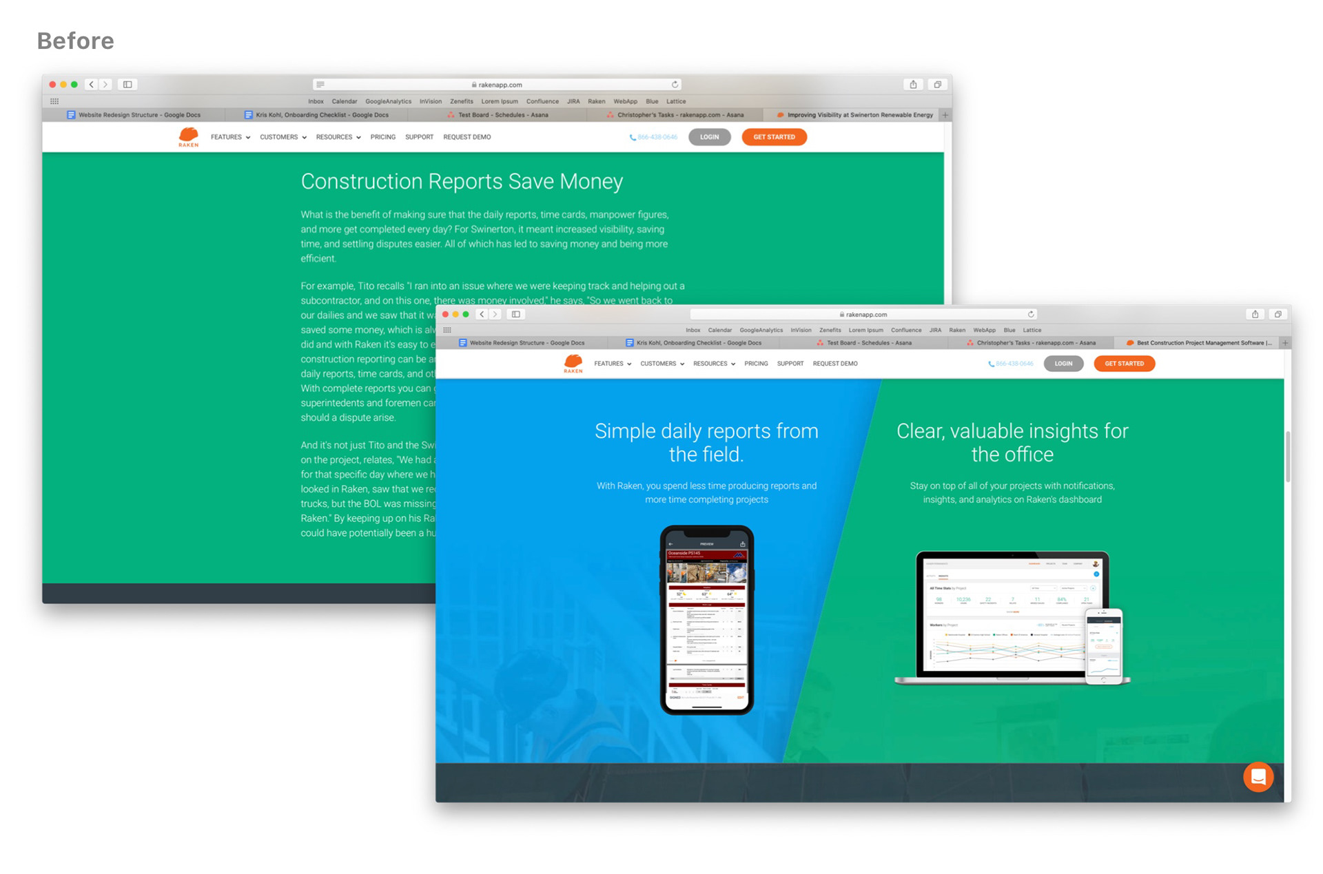
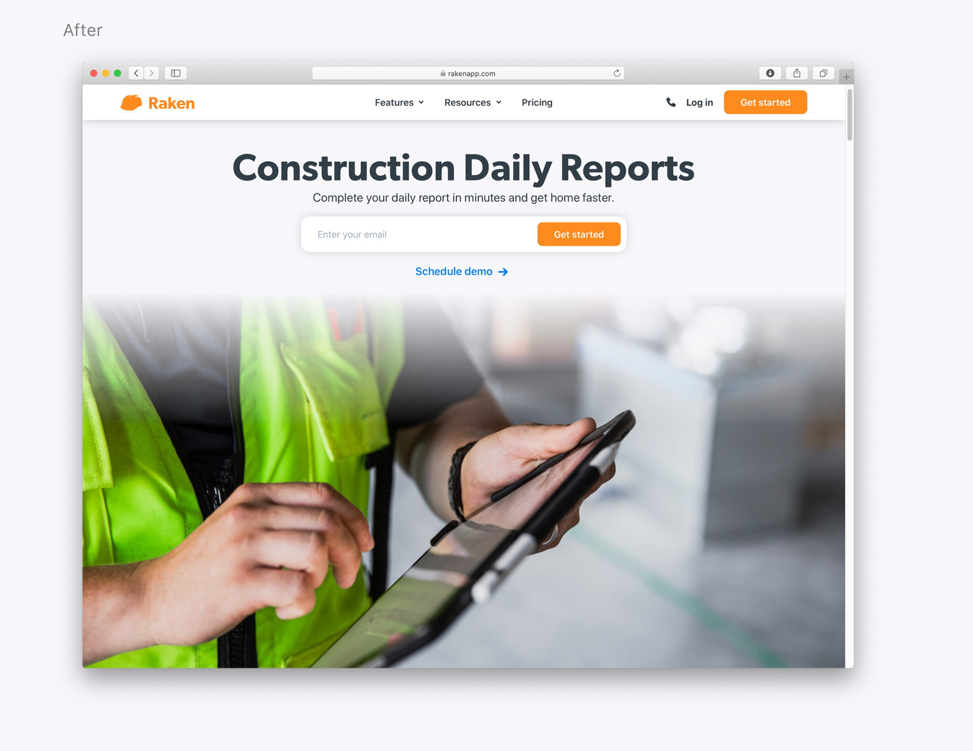
You can see that the colorful image backgrounds distract from written content, and the primary call to action: "Get Started"
Typography
Our previous website was filled with thin weights of Roboto, set at 14px, in white, over image backgrounds. Although that might look nice for people on nice displays indoors, it doesn't look great on a mobile device out in the sun on a construction site. I started by increasing the base rem to 16 on mobile and 18 on desktop, then I created a type scale based on the Perfect Fourth scale, manually rounding to a multiple of 4px, and manually calculating line height. Although this seems a little obsessive, it yielded a stronger type system that would scale across all devices. The benefit of the consistent type hierarchy is that users can scan through a page relatively quickly to find content that interests them, and then choose to interact further. Additionally, we switched all body paragraphs to system native typefaces, and all headings are Gibson Semibold.
Color
It's always so tempting to take a brand's primary color and use it to paint every available surface. The result can sometimes be very strong, but for Raken's website I wanted to use color more strategically. I decided to only allow our bright orange in two places: Our logo, and primary buttons. Secondary buttons, titles, and other interactive elements are each a single, secondary color. Non-interactive elements such as page backgrounds are all a light shade of grey. Since vibrant colors are only used in selective places, the user naturally understands the significance of them, and feels compelled to interact.
SEO and Page Speed
Native, Accessible
The prior goal of the Raken website is to get leads - about half of which come through paid advertising and email campaigns. Page speed, accessibility, relevant content, and more are all taken into consideration when a search engine indexes our site, and therefore I knew we had to make considerable advancements:
Increase in page length
The new, modular system makes it much easier to add sections of content with designated sections for tons of copy. This let our Paid Advertising team really scale up their keyword strategy on each page, leading in much better Google quality scores. More written content also makes the pages more engaging to our audience, who do a ton of research on products before they purchase.
Reduce the number of typefaces
Our previous website called in 9 weights of Google's Roboto webfont. That means that on every page load, the users machine calls 9 different URLs and manually loads each font one by one. Instead, I designated a single font (Gibson Semibold) for all headings, and the rest of the website is rendered with system-native typefaces.
Reduce the number of 3rd party scripts
Our previous website called single script independently, reducing the performance of our webpages. By integrating most of our scripts into Google Tag Manager, we were able to significantly increase the speed of the site. Most of our pages were scoring 50% before redesign, and most are scoring 80-90% post redesign. With more optimization of scripts, that number will get even higher over time.
Navigation
Hierarchy to the people
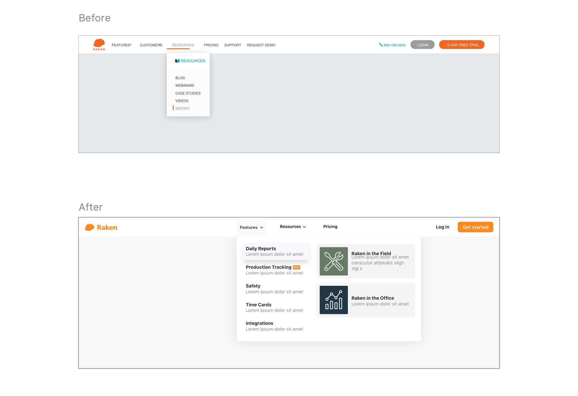
During our early user tests, we discovered that people were getting confused about which pages they should visit. Many of them wanted to continue to the "Customers" parent category, rather than starting their Free Trial, which was Raken's primary goal. I completely overhauled our navigation experience on desktop and mobile, allowing for more merchandising of features as the company grows. We narrowed the 6 parent categories down to 3: Features, Resources, and Pricing. By routing the traffic more smartly, we can help control the order that they experience pages. We also AB Tested many primary Call to Actions, and landed on "Get Started" as the best performing option.
Thank you for reading!
Explore the website for yourself: rakenapp.com