KPiQ: Market Smarter
Led design of an AI-powered marketing analytics platform from 0 to a $100k ARR waitlist, helping small businesses connect advertising spend with actual revenue.
The Problem
Small businesses are drowning in marketing data but starved of insight. There are great analytics tools for spending money on platforms like Google Ads and Facebook Ads, but no great way to connect how much you're spending to how much you're making. KPiQ was built to close that gap.
As Director of Design at Rocket Fuel Labs, I oversaw a team managing the product's development from concept through beta launch.
Target Audience and Methodology
Our primary users: SMBs and early-stage team members overwhelmed by marketing data and lacking meaningful insights. We employed the double diamond method — Discover, Define, Develop, Deliver — interviewing 10 founders in depth to understand their workflows and frustrations.
Three Core Features
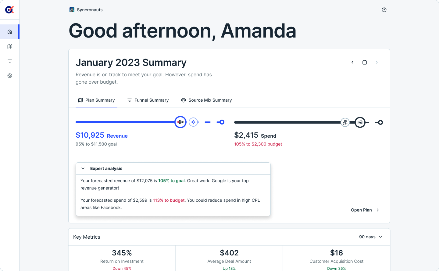
Performance Home: A centralized dashboard showing key metrics alongside AI-powered analysis, giving users an instant read on their marketing health without digging through raw data.
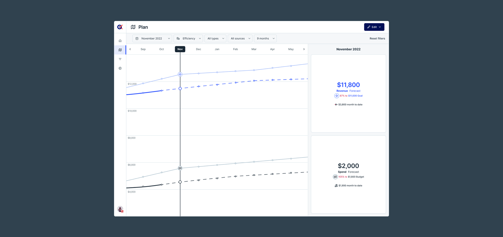
Plan: Revenue forecasting that compares actual vs. projected performance, helping small business owners make proactive budget decisions instead of reactive ones.
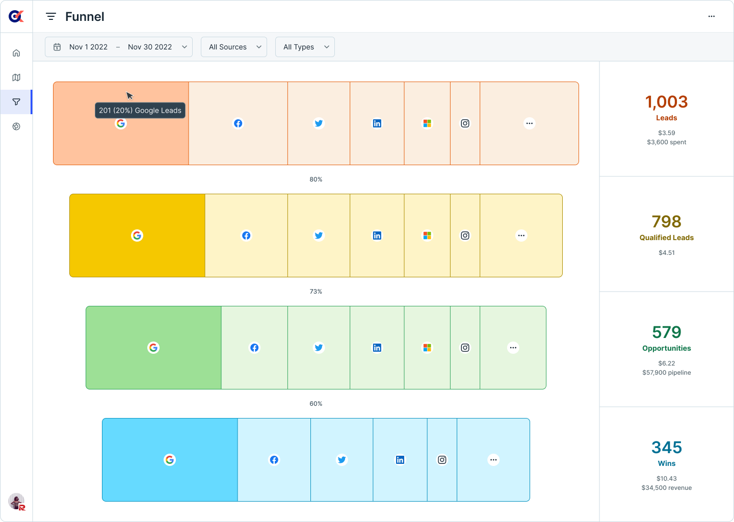
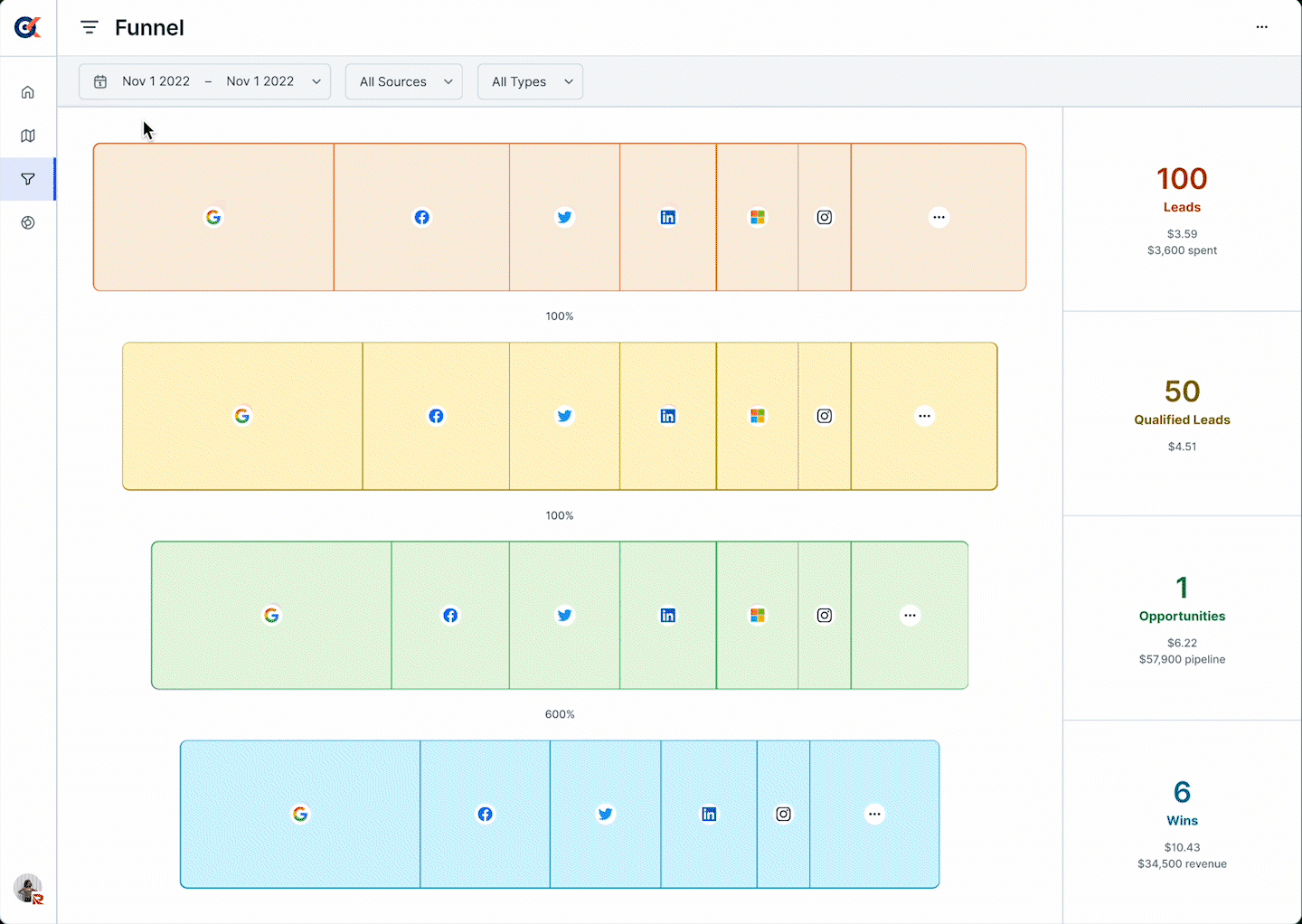
Funnel: A customizable visualization tool for multi-layer data analysis, letting users drill from high-level spend to individual campaign performance.
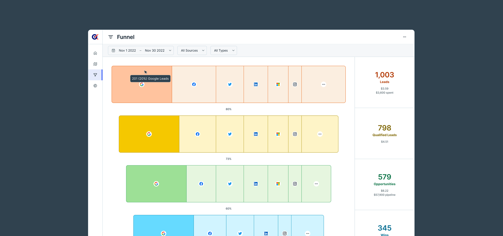
Zooming In: Designing the Funnel
The Funnel was the most complex of the three features, and the one that carried the most risk. Marketing analytics tools drown users in tables and knobs; we wanted an interactive visualization that guided decisions at a glance. The core design principle: progressive disclosure. Surface the most important insight first; let users dig deeper only when they want to.
The feature is accessible from the main dashboard. A high-level funnel chart shows spend distribution, with the ability to drill interactively into campaigns and time periods. We sketched both simplified and detailed concepts, exploring how to present multi-layer data without overwhelming users on the initial load.

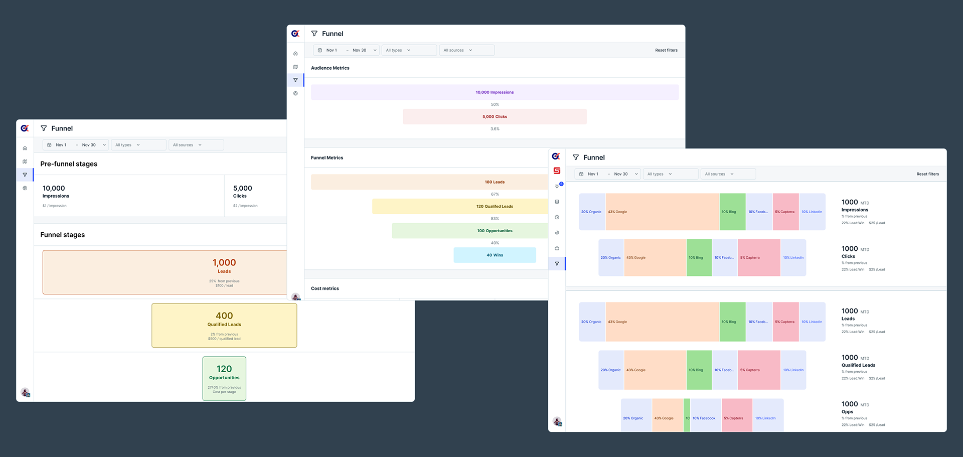
A clickable prototype validated our core assumptions. Users responded well to the simplicity and hover feedback, appreciating that the Funnel surfaced key insights without requiring them to dig through tables or configure complex settings first. After launch, we added tooltips and a guided tour to reduce friction for first-time users.
Beta Results
Beta launched in May 2023. Strong early signals confirmed the product was solving the right problem in the right way.
"Seeing my ad spend visualized side-by-side finally made it obvious which campaigns were actually working."
— Beta user, SMB founder